Portfolio
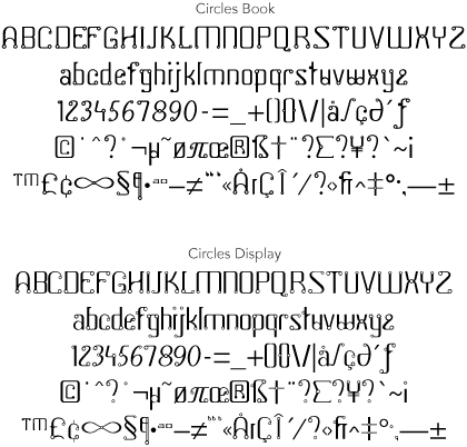
- The underlying concept for Circles© was to express key words that reflect ideas about my style and design process, including linearity, structure and mystery.
My reasons for creating two optical weights of the Circles font were:
To improve legibility at small point sizes but still retaining the essence of the design. This would have the effect of increasing the potential number of applications, such as the smaller text on a business card.
To test the durability or strength of a design beyond the first version, which could then determine the potential for additional weights.
To achieve my aim of creating a full, partially multi-lingual typeface, a secondary signature because it was the first.
Circles JY is published by JY&A Fonts, and is available for purchase from MyFonts and JY&A Fonts.


